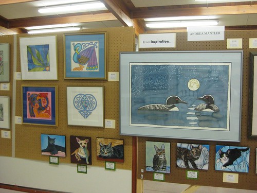
The abstract painting in the upper left is a design that came with a silk painting kit. The kit was given to me by my host family from a German exchange program I was on in high school. Although the design was traced from the one in the kit, the colours were my own choice.
At the time of the exchange, silk painting was popular in Europe (or Germany, at least), and the supplies could be found all over. There was basically nothing in North America, though, that I could find. (This was back before everyone had an internet connection, though, so I could be wrong.) This meant that getting additional supplies was extremely difficult. As a result, my second silk painting was done on an old silk shirt that had worn out. (Silk shirts had become popular and affordable when I was in junior high.) The silk shirt happened to be pink, which is why the bird from The Book of Kells is on a very bright pink background. You can also see (in person, if not in the photo) that my gold resist had separated, making it not very gold in places, and not very "resisting" in places. (This painting was a gift to my mother.)
I really like Celtic designs, but I wanted to create my own, rather than just copying ones done by others. The peacock is my own creation, loosely based on the bird from the Book of Kells. (This painting was a gift to my grandma S.) As you can tell from the white silk, I was able to get more supplies from Europe by this point. (I think I had someone mail them to me, although I could have picked them up while on a trip I took in second year university.)
The next painting was designed as a wedding present for two friends, both who were getting married around the same time. One of them liked fish, the other was religious, and used to draw the fish symbol for Jesus all the time in high school. The fish body is created from two interlocking rings, representing wedding rings. The tail of the fish forms two letters: H and P. One friend's first name starts with H, the other starts with P, and her husband's (and now her) last name starts with H. The whole shape creates a heart. Although I created two paintings with this design, both of my friends are represented in the design. (It takes me a long time to develop a design, and so I chose to do one that pulled double duty.)
The next painting is of a pair of loons, and was a wedding present for my mom and B when they married. My mom loves loons... they are common up north where she grew up, and where our family has a cabin. The Celtic influence in this one is much more subtle, but is still there, in both the stylization of the moon, and the "highlights" on the loons.

The dog in the next painting is my dad's dog, Nicky. Nicky is a pointer, and dad takes him pheasant hunting, hence the bird. I call this painting "Strange Encounters of the Bird Kind." ;) The Celtic influence is more prominent here again.
The final painting in the series is one I just completed this year, and was the only one actually for sale. (I owned the learning piece, but didn't feel right about selling it, since it wasn't my design, and also it has sentimental value.) However, since I was really proud of the heron, and didn't actually want to sell it, I priced it fairly high: $800. (I'm biased, but I think it's worth that much. If you think otherwise, I'd be interested in hearing your opinions... not that I'll necessarily change the price.)
My original intentions with the heron design was to create a set of two, each facing each other, one at night, and one during the day. This heron was from the day painting. Several years ago I had created a sun and moon design, but the second heron was only a very rough sketch. Then someone who was my roommate at the time got married, and I wanted to give a gift. I liked the moon design better than the sun design, so I combined those two parts into a single painting. That painting didn't have the river in the background, and the blue wasn't as "nighttime" as I wanted. I still wanted to complete the pair for myself, but didn't have time for many years.
This past fall, I taught a silk painting workshop at the art club I'm a member of. I wanted to have something I could work on while my students were working on their own, so I went back to my heron design. Even though I liked the moon better than the sun, I wasn't as happy with it as I wanted to be. I didn't have time to redesign the moon, so I borrowed the moon from the loon painting. (The original moon was a plain disk with stylized clouds around it.) I then sketched the river freehand with a pencil, rather than preparing the design on the computer like I normally do. (Well, like I have been doing for the later paintings, but the early ones I did on paper.)
I still intend on doing the second heron, but I haven't completely decided on how I want it to look. They will be facing each other, and the river will meander between the two paintings.
One of the things I found interesting about comments on the heron painting is that several people thought it had a Native American influence, and didn't notice the Celtic influence. I love a lot of the stylized Native American art, but I'm worried that people would think badly of me if I incorporated that style into my own work, the way I have with the Celtic. (My roots are half Scottish, and I don't feel there are quite the same feelings about what is "proper" with Celtic art.) At any rate, I feel I have developed a style that is recognizably my own, without being exceedingly derivative.
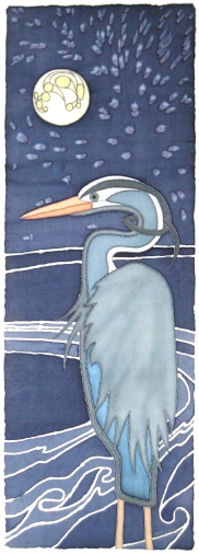
I am considering making a limited edition giclée (archival fine art prints) of my heron. If I charged around $100, that would probably just cover the set-up costs of the first print plus packaging, and on the second and future prints I would actually earn a profit (if you ignore the labour costs associated with creating the painting in the first place). The image size would be about 10 inches wide by 38 inches tall (if I remember correctly). If you were me, would you make prints? What would you charge? What size would you make the limited edition? (I can print them one at a time, but I need to know how many for numbering the edition... and smaller editions tend to result in the prints being more valuable in the long run. Not that I would make anything off their increase in value.)
Two other paintings that I have percolating in my head are of a fox, and of a loon turning an egg in a nest.
6 comments:
Beautiful work!
Thank you! :)
I LOVE the herron! Its got an art deco quality to it that totally screams my name.
which is kinda funny since you posted that some folks call it native american influenced and you consider it celtic influenced.
sadly $100 is too pricey for me.. $50 and I'm all over that, but I don't think that'd be enough $$ to make it worth your while
Cool! I love art deco, and art nouveau too! Isn't it funny how we can see different influences? Perhaps they're all there?
Sadly, $50 wouldn't cut it... I'd lose enough on the first, and make little enough on the following, that I'd be in danger of not making *any* profit at all, or even coming out in the red. Plus, if you don't like $100 for the print, you definitely won't like the framing costs.
I really love your style! Very nice. Keep it up! I think $100. for a print seems VERY reasonable. You could always make a smaller one for $50?
Thank you!
With the way printmaking is priced, I think it would have to be *quite* a bit smaller in order to have any real reduction in cost to me. :P
Post a Comment