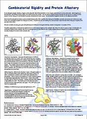
Poster
For those who are interested, here's my poster. It definitely could have used more "polishing." And more pictures and less text... but I'm currently at a state where I have text but little in the way of useful pictures.
Don't try to read it. Even if you can decipher the characters, the text likely won't make much sense. And if it does, I'll just feel embarrassed because it needs more polishing.
There's nothing quite like the stress of standing by a WIP that's been blown up to 3x5 feet to show all it's inadequacies... luckily there's enough text here that pretty much no one read it... they just asked for a synopsis, which I'm pretty good at giving.
3 comments:
I like how it looks! Lots of text (that I can't read even on the big size ;) ). woo! congrats on making the deadline and I think the poster looks cool.
What she failed to mention is that the background design (the Old Well) is her design that she so generously decided to share with the rest of the department for use in poster creating.
Great job anyway. :-)
Well, the Old Well background image was actually a standard UNC image that I vectorized (by hand using the evil PowerPoint) so it would look nicer blown up to extreme proportions.
Post a Comment