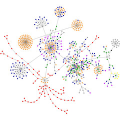
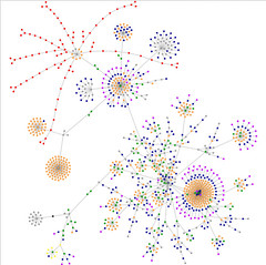
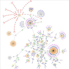
I noticed that if I went to a different tab in the browser and then returned, that the graph didn't keep going. I was curious: How big would it get if I let it run? If I ran it multiple times, would the image be the same? (Answer: similar, but not identical... there's some random numbers used in placing the vertices.) What did the colours mean? (I never did figure this one out, but I'm guessing it either has to do with connectivity, or with common domain names grouped by colour. The colours are consistent.)
Well, here's the results of my playing. Some of these are snapshots taken at different times in the run, some are separate runs, and the last is one where it looked like the applet had pretty much stopped:
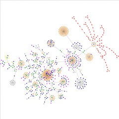
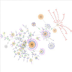
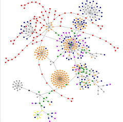
If you want to see how other people's web pages compare, check out the Flickr tag page. Or, try out the site on your own page. :)
1 comment:
I've done this and remember looking up the colors. I still have the note on my desk.
blue - links
red - tables
green - div tag
violet - images
yellow - forms
orange - BR tag, P tag, or Block quotes
black - html tag
gray - other
Post a Comment