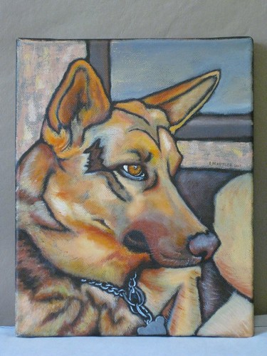
I thought I might be done last night, and so I signed the front and cleaned up the edges. (Amazingly... usually I only remember that as I'm about to do the varnishing.) However, my luck for remembering didn't hold... when I got home, I remembered that I had intended to add some colour to the centre of the ring on the chain. Whoops.
Oh well... I'll look at it all week, and decide if there's anything else that needs changing too. Since I'm apparently not done, is there anything else that jumps out at you as needing touching up?
4 comments:
I feel like the medallion on the chain could use some more dimension. Otherwise it looks absolutely wonderful!
Thanks! It's not a medallion, it's the licence tag. (Perfectly flat.) I didn't feel that putting the licence number on it was appropriate, but I did consider using that as my spot to sign. ;)
I was thinking about the license tag, too... it looks "too flat"... The ones on my dogs have subtle differences in light reflecting properties... they are a flat not shiny metal, but they do have - what's the word - "texture"? "dimension"? - they aren't quite as "flat" looking...
The word I was looking for is "bland". In the stucco wall, you have colour variation to indicate it is not smooth; even the sky in the window has subtle variations... I looked again, and there is *some* greyish in the blue (on my screen) but for the relative size of the space, it kind of sticks out as too plain, compared to the other large spaces on the picture. My opinions, of course; you are the artist and the expert :)
Post a Comment